Threw this together very quickly, just to exercise a muscle as it were. I've done very little image work recently, I don't want to go rusty. I've been mired in writing for a while now. I did have s hot at designing an album cover for a band I know, but I think I failed the audition. I'll probably share those on Black Dog vs Ice-Cream as they're not quite the flavour I like over here.
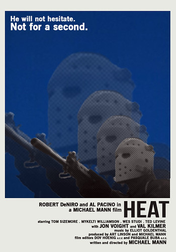
So this is my amateurish attempt to reimagine Heat as an early seventies poster. Let's say between 1971 and 1974. I had the idea on the bus, and then took a look at posters that seemed to fit what I was after - Dirty Harry, Cassavette's Husbands, The Getaway - just to get a feel for typefaces, authenticity. I was tempted to recast it with actors of the day (maybe young, subdued and beautiful Pacino in Val Kilmer's shoes...) but I didn't think I had the authority. Plus, I hoped there was a chance the end result would feel Criterion Collection.
It doesn't.
I think if you click it, you can go visit a bigger version on my Flickr (which needs some organising and some Holga photos up, if you ask me.)
I'm about 30% satisfied with it. The main image, layered and enlarged, was the original idea and now it's the part I like least.
Basically I just like the letters.
Would like to introduce you to another blogger: LS Gray. A very good - and opinionated - friend of mine. Have a read of Worthless Chat Monkeys. I hope you enjoy.
Ta ra for now.


I like the main image. I'm not 100% sure about the colour and typeface of 'He will not hesitate', but the bottom set of lettering really draws the eye.
ReplyDeleteThe blue is a direct steal from the scene where Neil's at his beach house. It's pure Mann sky.
ReplyDeleteI like the blue sky, I just wonder whether black text would look a little sharper against the blue. It's only a minor quibble.
ReplyDeleteI like the font and the colour fine. The image is great but the layering spoils it for me: all that negative space gone to waste. And you usually make such good use of negative space in your stuff.
ReplyDeleteI like negative space.
I do love negative space. But he's not a character lost or dwarfed by anything. He invades. He's kinetic. His expertise is - in it's purest sense - movement. He moves into a space and moves things out of that space. So it didn't seem appropriate to push him into a corner.
ReplyDeleteBut yeah. It might have looked better.